Solution:
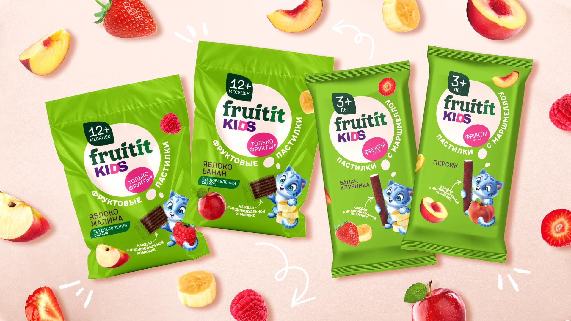
• We began by analyzing the children’s pastilles market — studying visual trends, competitor styles, and category-specific signal colors. We identified the target audience (children aged 12 months to 3+ years) and the emotions the brand should evoke: trust, joy, and curiosity.
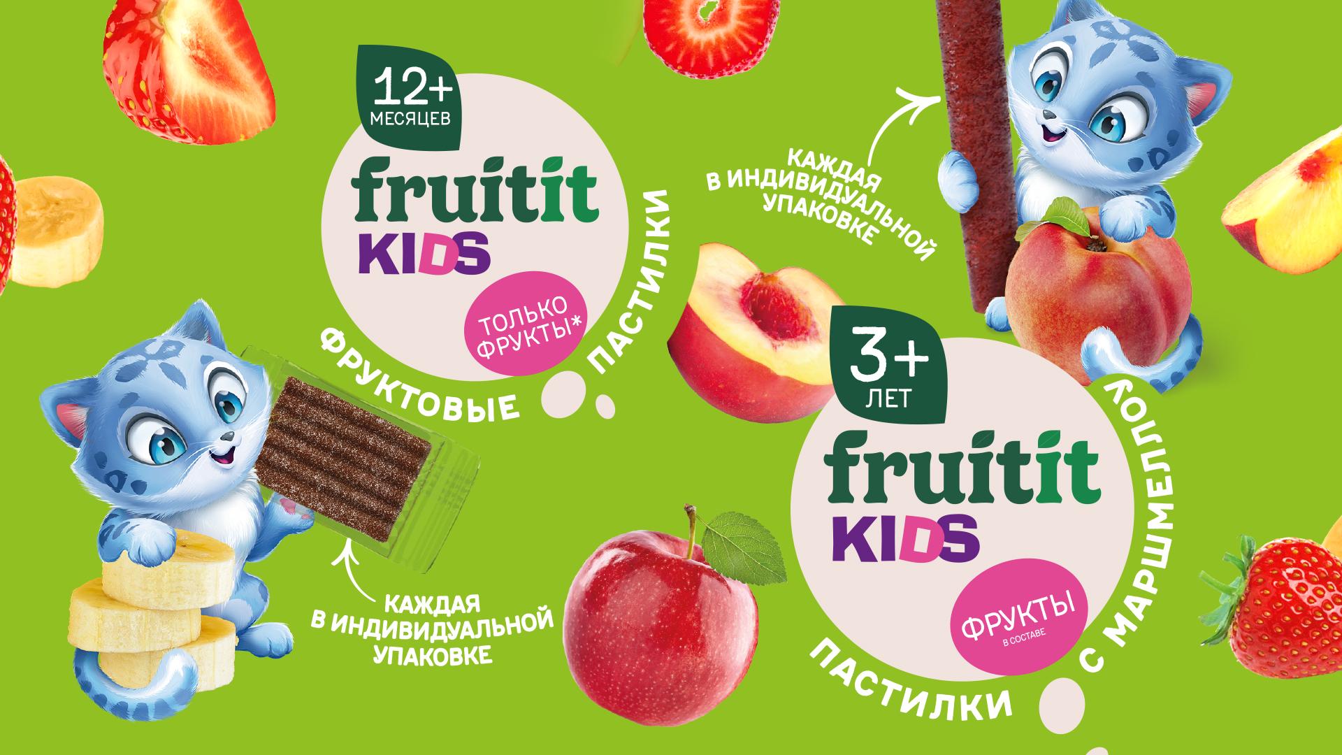
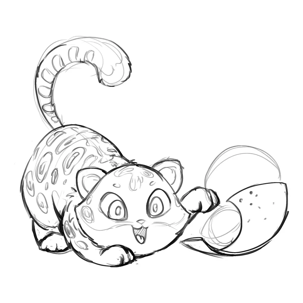
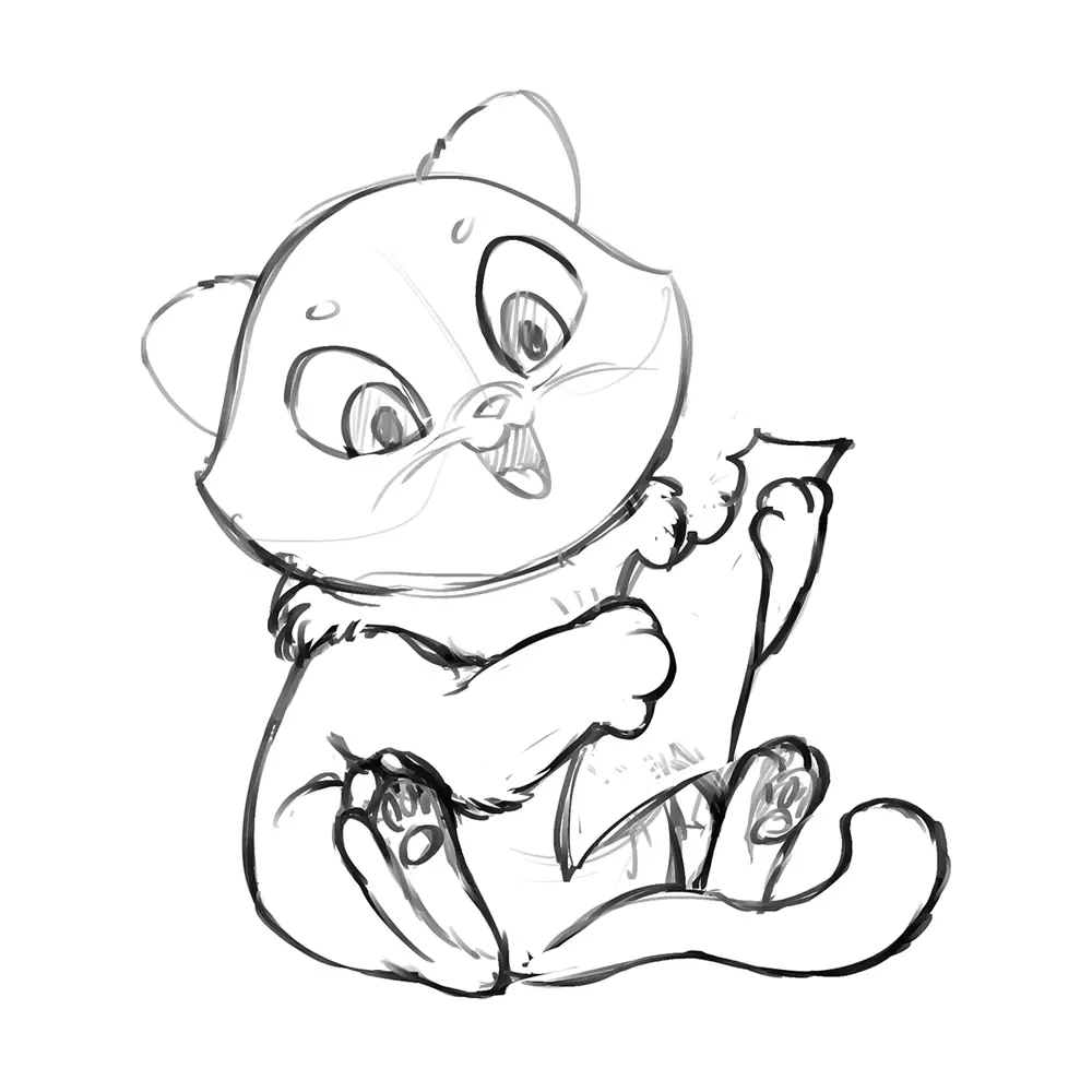
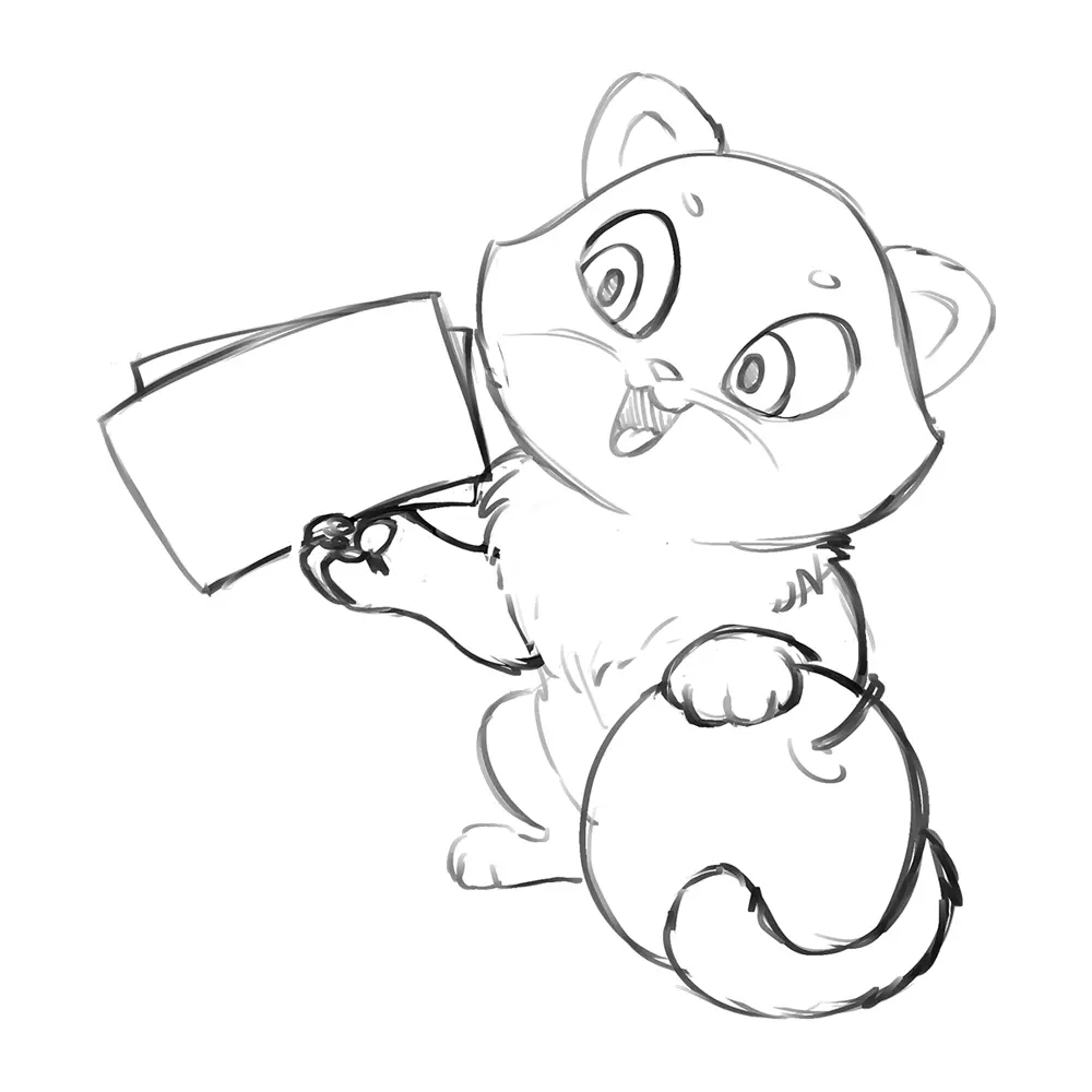
• We created a character — a friendly blue leopard, contrasting with the green background. Its poses and expressions (playing with fruits and pastilles) convey a light and playful character, bringing the packaging to life and adding emotional appeal.
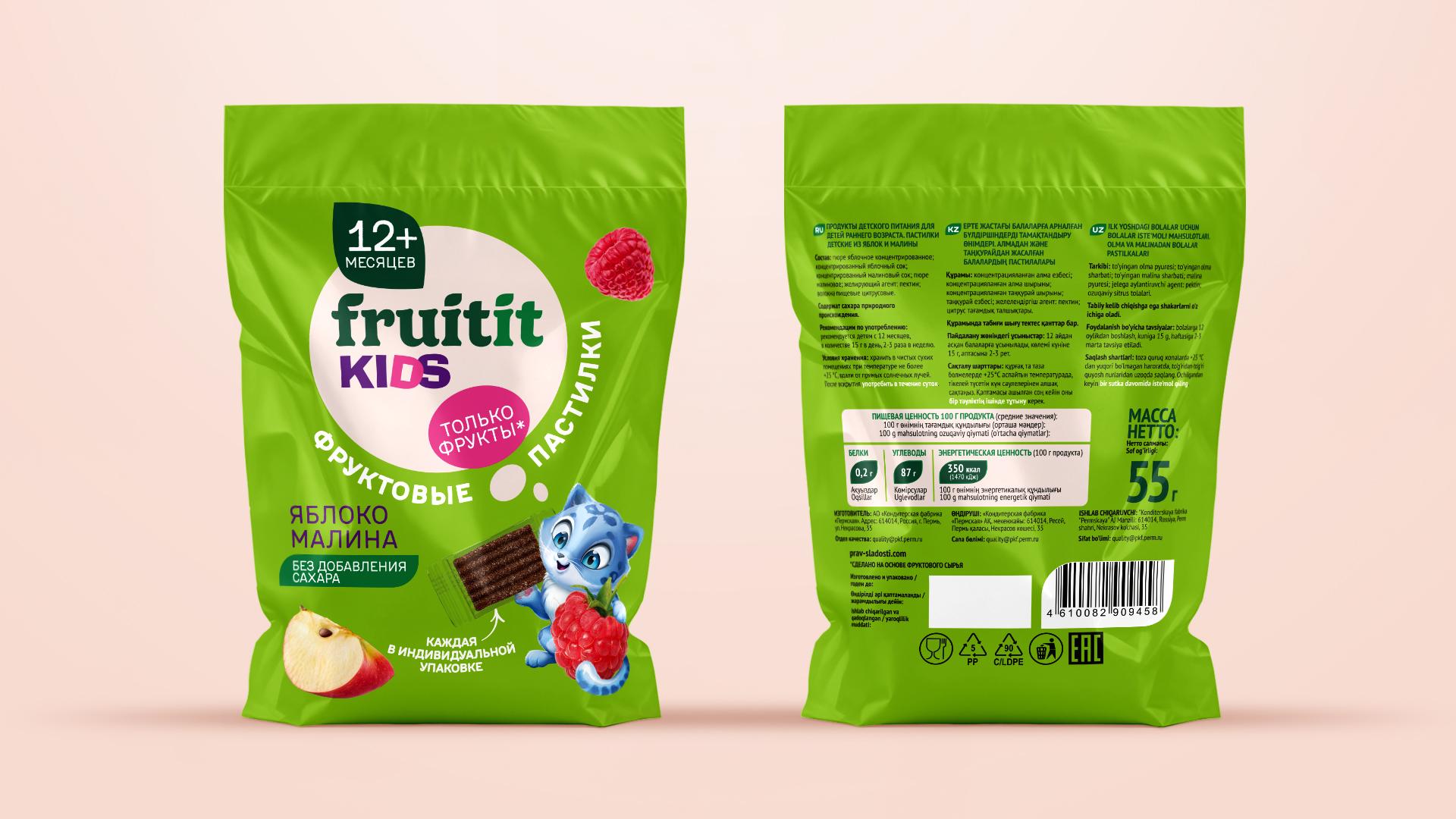
• The visual system is built around a rich green background, a white circle for the Fruitit Kids logo, and bright accents for the word “Kids.” A clear hierarchy of elements makes the packaging easy to understand: age, brand, flavor, and key benefits (“only fruit,” “no sugar”). Appetizing fruit illustrations and the active character create a lively, story-driven composition.
• We adapted the design for different formats (bags and stick packs), maintaining structure and readability. Print-ready mockups were prepared with finish recommendations — matte background with selective gloss on the character and fruits.
• A versioning system and promo templates were created: the kitten in various poses and colors for each flavor, as well as materials for POS and displays. All layouts are production-ready in CMYK, with instructions for the printing house.
 Send Us Mail
 Call Us